Most ads don't lose because the idea is bad. They lose in the first few seconds, or they never get enough budget to prove themselves. This guide covers the small changes that decide which version of an ad wins, how to get hooks and visuals right, and why the ad with the most impressions isn't always the one making the most money.
<aside> ⚡
Every ad in this guide is in Atria. See what any brand is running, how hard each ad is being pushed and the full script of every video. Start free at tryatria.com →
</aside>
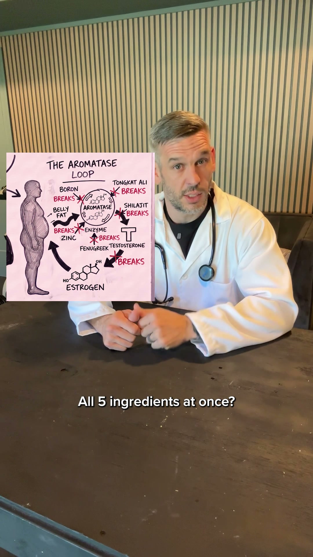
Mars Men sells a testosterone supplement and has run 29,452 ads on Meta, so it tests constantly. On 1 November it launched two versions of the same ad. The offer, the ad copy, the landing page and the two-minute script (from about the 15-second mark) were identical. Only the opening and the person delivering it changed: one version has a doctor in a lab coat talking to the camera, the other is a 3D-animated caveman. The doctor version became the #1 ad on the account. The caveman version peaked at #15.
#1: the doctor version
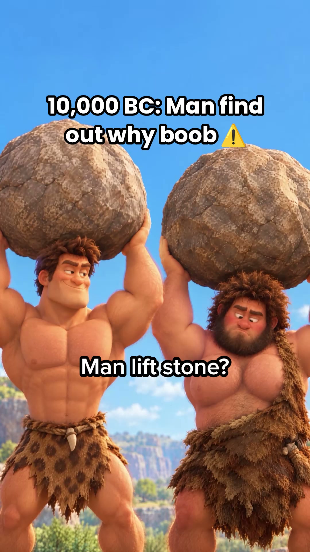
#15: the caveman version
Why the doctor won:
He talks to the buyer. "Man boobies, listen up" looks the viewer in the eye and names him in the first second. The caveman version is a story you watch from the outside.
He kills the objection before the pitch. In 12 seconds he says it isn't about being fat or lazy, and that skinny and jacked guys get it too. That takes the blame off the viewer and widens who the ad is for. The caveman version makes the same point slowly, through a metaphor, and its first shot puts a ripped caveman with a flat chest next to a chubby one, which tells every fit guy watching that this isn't his problem.